[FREE] fx:macro Lite / 19.11.23
Hi there! It's already Sunday, so it's time for another edition of fx:macro Lite! Great to have you here!
Recently, I talked to a couple of traders and at some point, someone mentioned the PMI. Everybody agreed that it's a great indicator to follow but they were surprised when I said I'm actually reading the report, and that I consider that “homework”. So, I thought it might be a good idea to write a short piece on it.
As for the image, I asked MidJourney to paint soft and hard data (because I couldn't come up with a prompt that includes PMI):
 |
Let's get started…
In case you missed the usual deep-dive yesterday, you can still sign up for that here and get access to the premium content:
💎 Central Bank Recap for this week
PMIs are homework and following central bank speakers is too. Here's a summary of what every one of them said this week:
fxm-2023-W47-18Nov-4-CB_Speaker_Recap.pdf
💡 ISM Purchasing Managers Index
Staying up-to-date on what's going on macro-wise means following central banks and economic data releases as they come out among other things. PMIs are on my “required reading” list, which means I'll read through every release.
Here's a short chart that shows why: the blue line is the 12-month rate of change of the S&P 500, and the orange line is the ISM Manufacturing PMI. You can easily see the correlation:
 |
First, let's look at the difference between hard and soft data, and why that's important:
- Hard data is more or less objective and not based on people's perceptions or feelings: GDP, unemployment rates, industrial production, and things like that.
- Soft data is often survey-based and asks for a subjective assessment of “current conditions” or expectations of the future: consumer sentiment, inflation expectations, business conditions, etc.
t's important to know what kind of data you're dealing with, and PMIs belong in the second category. Check out this post by Brent Donnelly for a great overview.
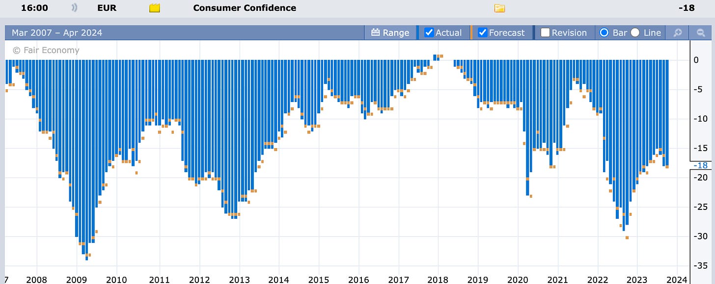
One thing to keep in mind is that survey-based soft data will often capture the “mood of the time”. People (and businesses) are feeling good, bad, confident, insecure, optimistic, pessimistic or whatever for a variety of different reasons. Just take the European Consumer Confidence as an example: are conditions right now really as bad as they were around when COVID-19 hit? And why was sentiment then way better than during the GFC in 2008/9?
 |
How people feel about (their) reality often doesn't have much to do with what reality is really like. Consumers are probably more extreme than businesses in that regard. Just put consumer sentiment data on a chart like the PMI vs. the S&P 500 above, and you'll most likely end up with something useless.
By the way, the dumbest thing I’ve heard anyone say about this kind of data is that European Consumer Sentiment is negative while the US number is positive because Europeans generally aren't as optimistic as Americans. (This is probably true but ignores the important fact that you can't compare the absolute levels of two different surveys that aren't adjusted for a variety of factors.)
 |
Back to the PMIs. There are different ones available, the most well-known are the ones released by the Institute of Supply Management, or ISM:
- Manufacturing PMI, and
- Services PMI.
Services should in theory be given more weight than Manufacturing because of the two sectors’ different contributions to overall GDP but in practice, both are equally important. And there's actually a third report, the Hospital PMI, but that's not followed by… anyone at all?
The respondents to the survey are usually purchasing managers, which means they tend to be highly qualified and since they're responsible for buying raw materials and stuff to produce things, they're the ones who should know best about how business is going or how it's expected to go.
A headline PMI number above 50 means that the economy is expanding, and a number below 50 means it's contracting but as is usually the case with economic indicators, the direction of travel and rate of change matter more than the actual level.
The PMIs consist of a series of sub-indexes, and the above/below 50 threshold applies here as well. The report provides a nice summary of the headline number and all of the sub-indexes (colour was added by me):
 |
The Prices sub-index has received a bit more prominence over the last few years as a forward-looking inflation gauge. New Orders and New Export Orders are also considered forward-looking. This table alone is worth looking up the report and going through it.
Another section I always read is the one with the comments from survey respondents. It's very anecdotal and definitely not representative but it gives you a good feeling of what's actually going on in the economy:
 |
While the ISM PMIs are definitely the more important ones, they are only available for the US. Another set of PMIs, currently published by S&P Global together with different partners, provides a more granular view: you can get reports for individual countries or a bit more obscure surveys like the one of Global Copper Users.
The reports aren't as detailed as the ones from the ISM but there's a good 4- or 5-paragraph summary at the end. You can read through that in less than five minutes per country:
 |
You can probably see why I like these reports so much: you get a lot of useful info in a few paragraphs, even if it's “only” soft data.
One tool I look at every week is the Bloomberg PMI heatmap:
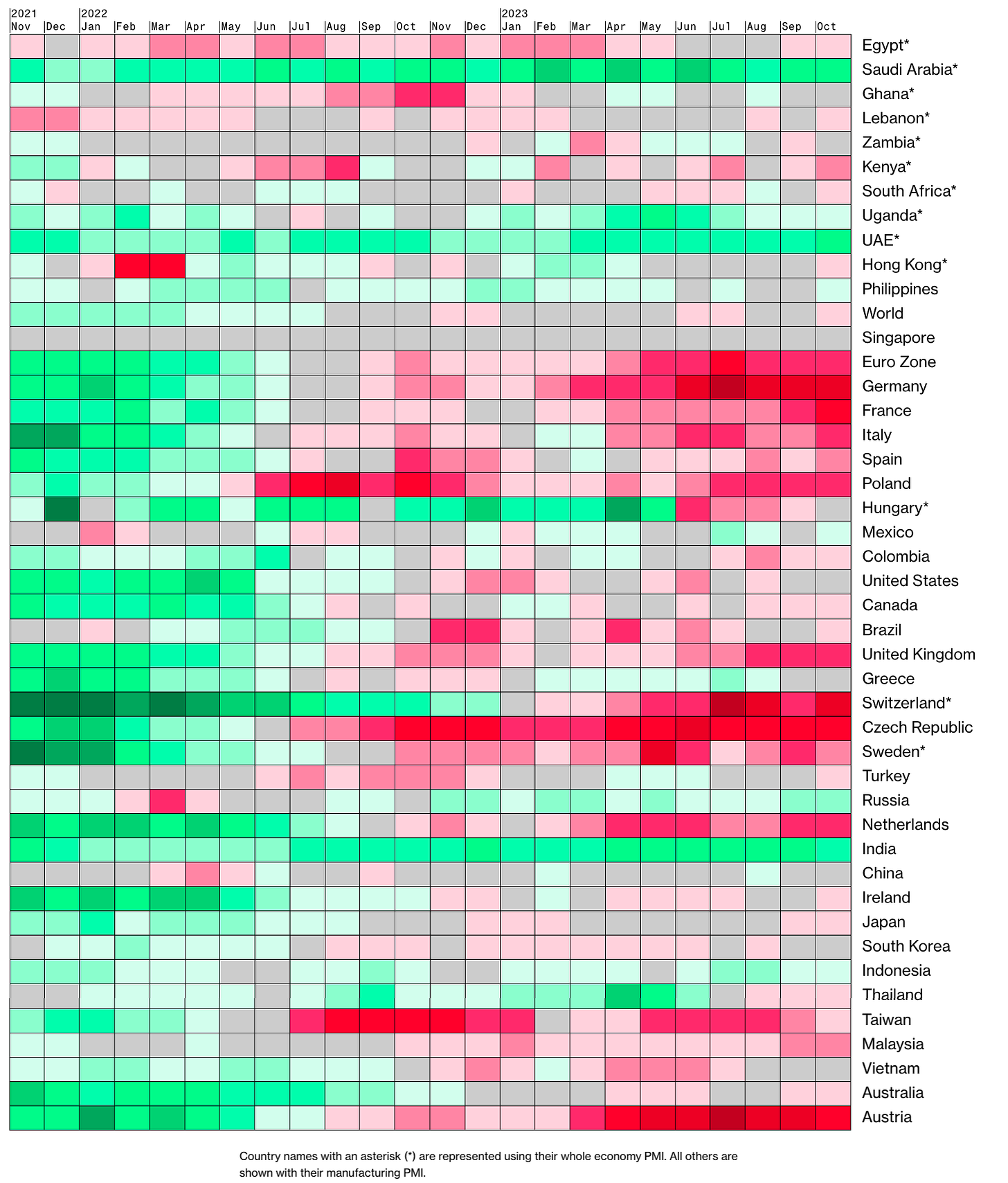 |
It's useful because it shows the rate of change (which is what's important) and compares that to the rest of the world. And it's a bit less useful than it could be because it only shows the Manufacturing PMIs, which is an incomplete picture at best.
Oh, and they also have a map view, which is probably the worst way to visualize this data: Russia is the largest country by size but in terms of global manufacturing it's irrelevant. I don't want to offend the Canadians but it's kind of the same with them too:
 |
That's it for this week, let me know what you think!
Until next weekend
FXMG
fx:macro
Join 5,000+ readers and sign up for the free newsletter!
Hi there! It's already Sunday, so it's time for… an announcement! TL;DR: This is going to be the last newsletter for a while. You don't need to do anything, I'll probably be back but I don't know when, and I will neither sell your email address nor send you spam in the meantime. I've been writing fx:macro for about 20 months now, and it has grown into something I'm proud of. As I've often said: it helped me in a lot of ways to become more structured and more concise, I've met great people...
Hi there! It's already Sunday, so it's time for another edition of fx:macro Lite! Great to have you here! This week's image shows a cesspool with a gold nugget in it. Which has a lot to do with the last bit of homework I do every day. Read more about that below… Let's get started… In case you missed the usual deep-dive yesterday, you can still sign up for that here and get access to the premium content: 💎 Central Bank Speaker Recap for this week Speaking of homework… here's this week's...
FX:MACRO - Week 49/2023
Welcome to issue #84 of fx:macro! Summary Research folder with all material: Google Drive The archive will all previous issues can be found here: https://fxmacro.ck.page/ Playbook for next week This is the shortest possible summary of everything you will find in the rest of this newsletter. Please check out this article about what this summary aims to provide and what its limitations are. Currency Drivers For an explanation check out this link. Week in Review Central bank speaker recap for...